UI / UX Design
Improving Donation and Service Conversion for a Anti-Bullying Nonprofit
Redesigned a nonprofit website experience to improve donation flow, increase service visibility, and create a more accessible, trust-driven experience for families seeking support.
Year :
2025
Industry :
Nonprofit (Bullying Support & Family Services)
Client :
All Is Well Family
Project Duration :
5 weeks

Overview:
All Is Well Family is a nonprofit organization dedicated to supporting children and families affected by bullying. The platform provides access to counseling, support groups, and educational resources while also encouraging donations to sustain its mission.
While the organization offered meaningful services, the digital experience lacked the clarity, structure, and visual trust needed to effectively guide users—particularly parents navigating urgent or emotional situations.
The Problem
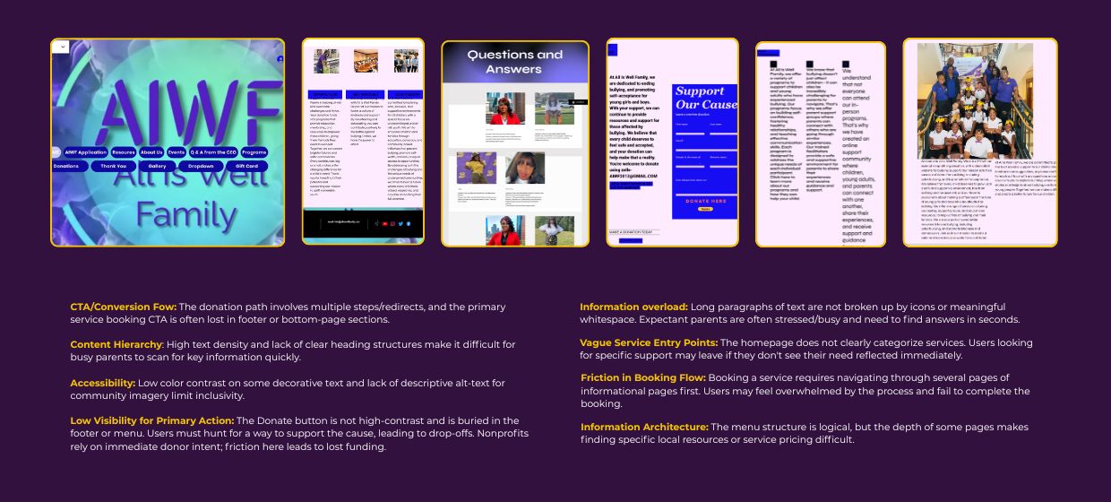
The website created friction in both service access and donation flow, making it difficult for users to quickly find support or take action.
Key issues included:
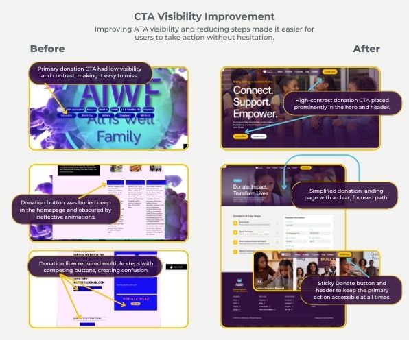
Multi-step donation flow with redirects, increasing drop-off risk
Primary actions (Donate, Get Help) not consistently visible
Dense content and lack of hierarchy, making information hard to scan
Outdated visual design reducing perceived trust and credibility
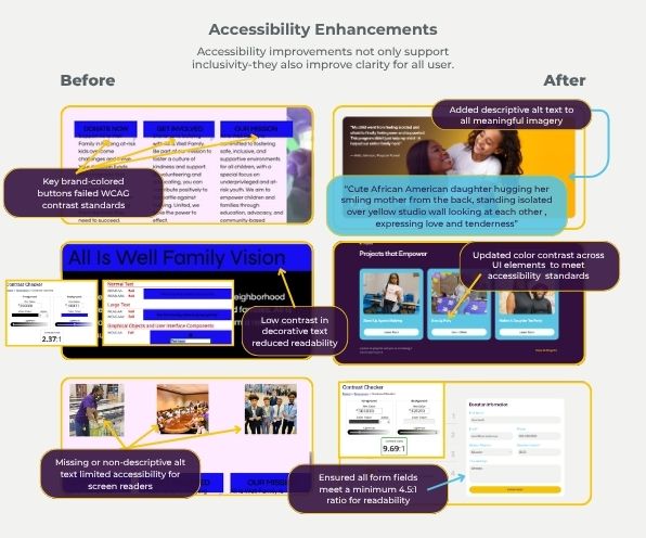
Accessibility gaps, including low contrast and non-descriptive alt text
Navigation depth making it difficult to locate specific services or resources
My Approach
Evaluated user journeys for both donors and families seeking support
Prioritized key actions (Donate, Get Help) across all entry points
Simplified content structure to support quick scanning and comprehension
Introduced accessibility improvements to support inclusive design
Modernized visual design to build trust and emotional connection
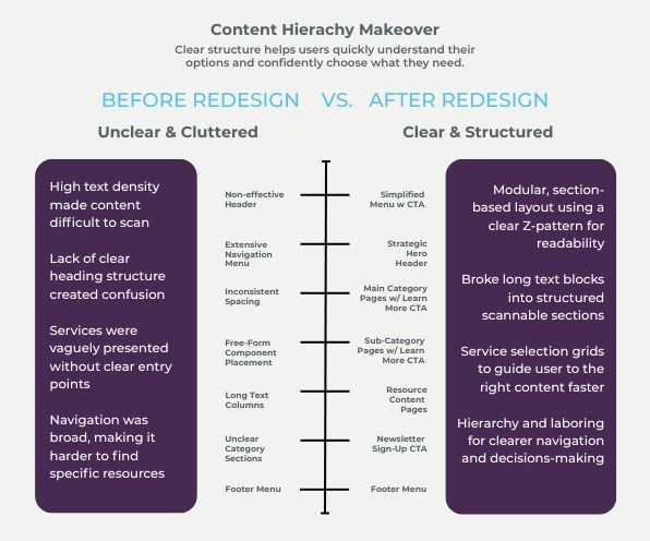
Key Improvements
Designed a high-conversion homepage focused on impact-driven messaging
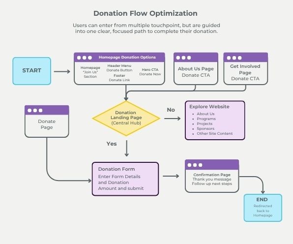
Simplified the donation experience with a dedicated, streamlined landing page
Implemented a sticky header with persistent primary CTAs (Donate / Get Help)
Introduced a mega menu (desktop) and simplified mobile navigation for faster access
Created a consistent card-based system for services and resources
Developed a dynamic CMS structure for blog and educational content
Established an accessible color palette and standardized typography system
Introduced custom illustrations and impact visuals to strengthen emotional connection
Experience Highlights
Impact-first messaging to support emotional engagement
Clear, persistent CTAs to guide user action
Simplified navigation for faster access to resources
Accessibility-focused design improvements
Outcome
The redesigned experience improves how users find support, understand available services, and contribute to the organization’s mission.
By simplifying the donation flow, strengthening visual trust, and improving content clarity, the new design supports increased user confidence and creates a more direct path toward both service engagement and donations.
UX Insights
In mission-driven platforms, users are not just navigating—they are seeking reassurance. Clarity, accessibility, and emotional trust directly influence whether they take action.
Closing
This project reflects my approach to designing user-centered experiences that balance clarity, accessibility, and emotional impact—especially in environments where trust and ease of use are critical.
More Projects


New release
Preview
UI / UX Design
Improving Donation and Service Conversion for a Anti-Bullying Nonprofit
Redesigned a nonprofit website experience to improve donation flow, increase service visibility, and create a more accessible, trust-driven experience for families seeking support.
Year :
2025
Industry :
Nonprofit (Bullying Support & Family Services)
Client :
All Is Well Family
Project Duration :
5 weeks
Overview:
All Is Well Family is a nonprofit organization dedicated to supporting children and families affected by bullying. The platform provides access to counseling, support groups, and educational resources while also encouraging donations to sustain its mission.
While the organization offered meaningful services, the digital experience lacked the clarity, structure, and visual trust needed to effectively guide users—particularly parents navigating urgent or emotional situations.
The Problem
The website created friction in both service access and donation flow, making it difficult for users to quickly find support or take action.
Key issues included:
Multi-step donation flow with redirects, increasing drop-off risk
Primary actions (Donate, Get Help) not consistently visible
Dense content and lack of hierarchy, making information hard to scan
Outdated visual design reducing perceived trust and credibility
Accessibility gaps, including low contrast and non-descriptive alt text
Navigation depth making it difficult to locate specific services or resources
My Approach
Evaluated user journeys for both donors and families seeking support
Prioritized key actions (Donate, Get Help) across all entry points
Simplified content structure to support quick scanning and comprehension
Introduced accessibility improvements to support inclusive design
Modernized visual design to build trust and emotional connection
Key Improvements
Designed a high-conversion homepage focused on impact-driven messaging
Simplified the donation experience with a dedicated, streamlined landing page
Implemented a sticky header with persistent primary CTAs (Donate / Get Help)
Introduced a mega menu (desktop) and simplified mobile navigation for faster access
Created a consistent card-based system for services and resources
Developed a dynamic CMS structure for blog and educational content
Established an accessible color palette and standardized typography system
Introduced custom illustrations and impact visuals to strengthen emotional connection
Experience Highlights
Impact-first messaging to support emotional engagement
Clear, persistent CTAs to guide user action
Simplified navigation for faster access to resources
Accessibility-focused design improvements
Outcome
The redesigned experience improves how users find support, understand available services, and contribute to the organization’s mission.
By simplifying the donation flow, strengthening visual trust, and improving content clarity, the new design supports increased user confidence and creates a more direct path toward both service engagement and donations.
UX Insights
In mission-driven platforms, users are not just navigating—they are seeking reassurance. Clarity, accessibility, and emotional trust directly influence whether they take action.
Closing
This project reflects my approach to designing user-centered experiences that balance clarity, accessibility, and emotional impact—especially in environments where trust and ease of use are critical.
More Projects
New release
Preview